Tapestry
Mobile
6 Weeks


Overview
Tapestry is a Bible learning app designed to help young adults engage with Scripture through a structured, gamified experience. The app allows users to progress through increasingly detailed levels of understanding. My task was to establish a visual language through illustrations and color and design an engaging, user-friendly product that balances learning depth with ease of use while encouraging daily engagement and long-term retention.
Problem:
Young adults often struggle to engage consistently with Bible study because:
Traditional Bible learning tools feel overwhelming or unstructured.
Existing structured plans use outdated formats.
There’s a lack of motivation to continue studying over time.
Existing apps don’t create a sense of progress or accomplishment.
Challenge:
How might we design a learning experience that makes Bible study more engaging and motivating without sacrificing depth and accuracy?
Solution:
The key concept behind Tapestry as a multi-tiered learning platform, where users progress through five levels, reflected in ranks, of depth, seeing the full “tapestry” of the Bible:
✅ Level/Rank 1 – High-level overview of major stories and themes
✅ Level/Rank 2 – Deeper narrative connections between books
✅ Level/Rank 3 – Focus on theological significance and interpretation
✅ Level/Rank 4 – Verse-level exploration and context
✅ Level/Rank 5 – In-depth study of historical and cultural context

Key Design Goals:
Create a structured learning pathway that reduces cognitive overload.
Introduce gamification to motivate and track progress.
Make the app visually appealing and easy to navigate.
Surface related content to increase reenforce learning and maintain retention.
Process
1. Research & Strategy
User Interviews: I interviewed 10 young adults involved in Bible study groups to identify pain points and motivations.
60% reported feeling overwhelmed by the complexity of the Bible.
50% said existing Bible study apps lacked clear guidance or they didn’t know of apps with this purpose.
70% stated they forget important concepts they learned during study.
Competitive Analysis: I studied how learning apps (like Duolingo and Brilliant) handle engagement and progression.
Found that gamification and clear progression were key to retention.
Discovered that immediate user investment in a first lesson increased positive learning outcomes.
Identified the importance of short, digestible lessons to encourage daily use.
Recognized the usefulness of short quizzes in order to improve knowledge retention.
2. Ideation & Design
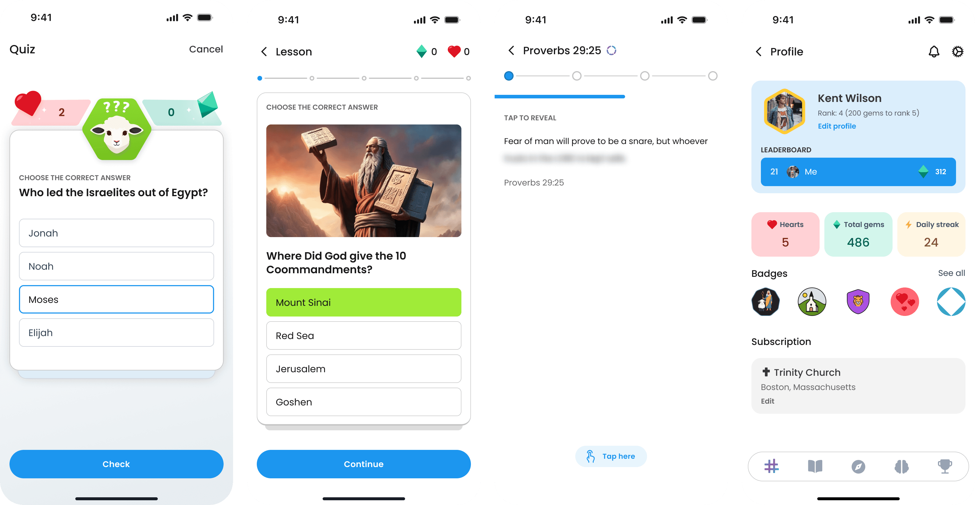
I structured the app around a linear progression system with unlockable levels, combining elements of gamification (XP, badges, streaks, quizzes) with spiritual depth:
Progress Bar: Visible progress through each lesson encourages completion.
Streaks: Daily usage builds momentum and creates habit formation.
Rewards: Unlock badges and milestones to provide positive reinforcement.
Quizzes: Interactive activities based on completed content to improve learning and track progression.
Adaptive Content: Users can repeat or review challenging lessons.
Wireframes & Prototypes:
I used low-fidelity wireframes to explore flow and hierarchy, then refined them based on early user feedback.
Reduced cognitive load by breaking up the course-like structure (Tapestry) and independent lessons (Threads).
Organized content into a card-based interface for clarity and cards with depth to denote multi-steps lessons.
Created immersive quiz experience to make testing fun and engaging.
High-Fidelity Design:
I designed the UI with a clean, modern aesthetic:
Used a soft color palette inspired by natural tones to reflect the spiritual nature of the content.
Utilized color and iconography to conceptually link activities, actions, and areas across the app.
Designed typographic hierarchy to separate scripture from commentary.
Incorporated micro-interactions (e.g., subtle animations with haptics) to enhance user experience.
I structured the app around a linear progression system with unlockable levels, combining elements of gamification (XP, badges, streaks) with spiritual depth:
Progress Bar: Visible progress through each lesson encourages completion.
Streaks: Daily usage builds momentum and creates habit formation.
Rewards: Unlock badges and milestones to provide positive reinforcement.
Adaptive Content: Users can repeat or review challenging lessons.
3. Hypothetical Testing & Validation
Since Tapestry was still in the early prototype stage, I prepared a validation plan based on industry best practices and user behavior benchmarks:
Usability Testing Plan: I designed a moderated user testing script focused on:
Completion rate for lesson modules
Time to complete each lesson
User satisfaction with lesson progression
Engagement with streak and badge systems
Hypothesis: Based on similar apps (e.g., Duolingo, Brilliant), I expected that:
Completion rates would increase by 20% if total lesson length including activities were limited to 4–5 minutes.
Streak-based reinforcement would improve daily engagement by at least 30% within the first 2 weeks.
Global user leaderboard would foster a sense of community and encourage repeat daily users.
Gamification elements (badges, levels) would encourage repeated use and increase retention especially past the initial 2 weeks.
Planned Iteration Strategy:
If lesson completion rates were low → I’d test shorter and/or longer lesson formats in different testing groups.
If users struggled with progression clarity → I’d adjust the learning path hierarchy and surface more guidance particularly around the level structure of the learning.
If engagement with badges and streaks was weak → I’d experiment with different reward mechanisms and frequency of rewarding (e.g., unlocking new content or themes more or less often).
4. Expected Outcomes
Based on comparable engagement data from other gamified learning apps:
✅ Estimated lesson completion rate of 65% after two weeks.
✅ Expected a 30% increase in daily active users with consistent streak incentives.
✅ Anticipated a 20% improvement in user retention after introducing streaks and progress indicators.
✅ Forecasted a higher engagement rate for higher-tier lessons once early-level success was reinforced through gamification.
5. What I’d Measure Post-Launch
To evaluate success and refine the product post-launch, I’d track:
• Daily Active Users (DAU): To monitor engagement over time.
• Lesson Completion Rate: To measure how effectively users progress through content.
• Retention After 4 Weeks: To understand long-term engagement.
• Session Length: To determine if users are engaging with content deeply or bouncing early.
💪🏻Takeaway
Designing Tapestry taught me a few lessons: First and foremost: the difference between gamification and a game–how to maintain a educational feel without creating a bible version of Candy Crush. Second, how to balance engagement and depth in a structured learning app.
By combining intuitive UX with meaningful gamification, I created an experience that motivates users to engage consistently with increasingly complex content — solving the challenge of measurable improvements in learning and retention.
Bonus: Favorite Flow I Designed
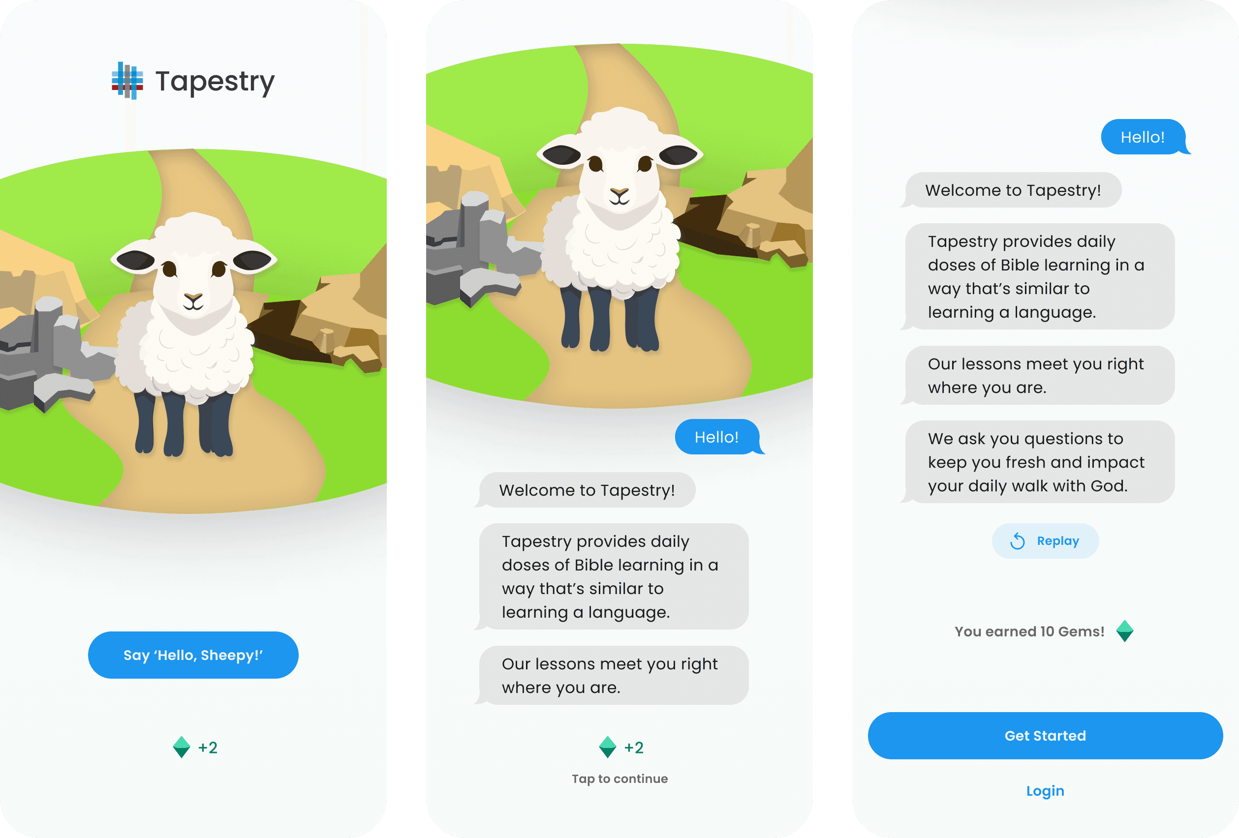
A strong onboarding flow sets the foundation for user engagement and long-term retention. For Tapestry, I designed an onboarding experience that balances clarity, motivation, and speed to ensure users feel connected and invested within the first 10 seconds.
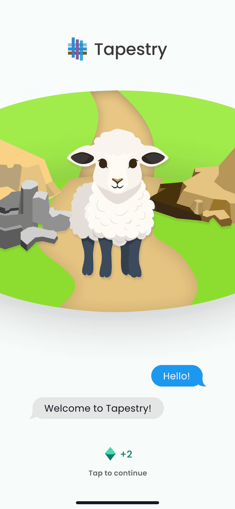
👋🏻 Introducing Sheepy

To build an immediate sense of connection, I introduced a character named Sheepy — a friendly guide who helps users navigate the app. Research shows that adding a character or mascot increases emotional connection and lowers cognitive load during onboarding. Sheepy creates a sense of familiarity and approachability while reinforcing the app’s tone of encouragement and growth.
Design Decisions:
Sheepy provides context and encouragement through conversational dialogue.
Subtle animations and micro-interactions makes the onboarding feel dynamic and responsive.
The character reinforces the app’s gamified structure by tying feedback to progress.
💎 Rewarding Early Investment
To increase motivation and reduce drop-off, I added an early reward system during onboarding:
Users earn gems after completing the first onboarding step.
This establishes a sense of progress and psychological investment — creating a “loss aversion” effect where users are more likely to continue to avoid losing their initial progress.
Design Decisions:
Immediate feedback for the reward (haptic + visual confirmation).
Tying the reward to progression encourages users to start a lesson.
🛝 Minimizing Friction
From personal experience, I know that a long onboarding process with a required quiz or complex account setup can discourage engagement — especially in an educational app. For Tapestry, I focused on a fast, two-minute flow that removes unnecessary friction while keeping deeper customization available for later.
Optional Placement Quiz: Users can skip the quiz and jump straight into a lesson.
Account Setup at the End: Allows users to engage with content first before committing to an account.
Progressive Onboarding: Relevant features (like advanced settings) are introduced contextually after users are already engaged.
Design Decisions:
Reduced onboarding to under 2 minutes to increase completion rate.
Progressive disclosure introduces complexity only when needed.
Focused on fast wins to give users a sense of accomplishment before asking for more engagement.

Expected Impact:
✅ Shorter onboarding = higher completion rates and faster time to first lesson.
✅ Early rewards + progression-based reinforcement should increase daily retention by 15–20%.
✅ Allowing users to skip complex setup reduces abandonment during onboarding.
This approach ensures that users are drawn in quickly, feel a sense of progress from the start, and are motivated to keep going — all without overwhelming them. By balancing speed, motivation, and psychological reinforcement, I created an onboarding flow designed to convert initial interest into long-term engagement.